From its story, through intended meaning, to first hand notes from the artist, the details behind the art that visualizes an album can significantly enhance its sonic experience. Comparing your initial take on the cover art with the vision of an artist can give you a wider idea about its creation and intended meaning.
Our today’s guest, Jacopo from Roma hardcore band SHORT FUSE gave us his and the band’s perspective on the cover art that spiced up their recent album “Embrace Yourself”, released on the California based label New Age Records.
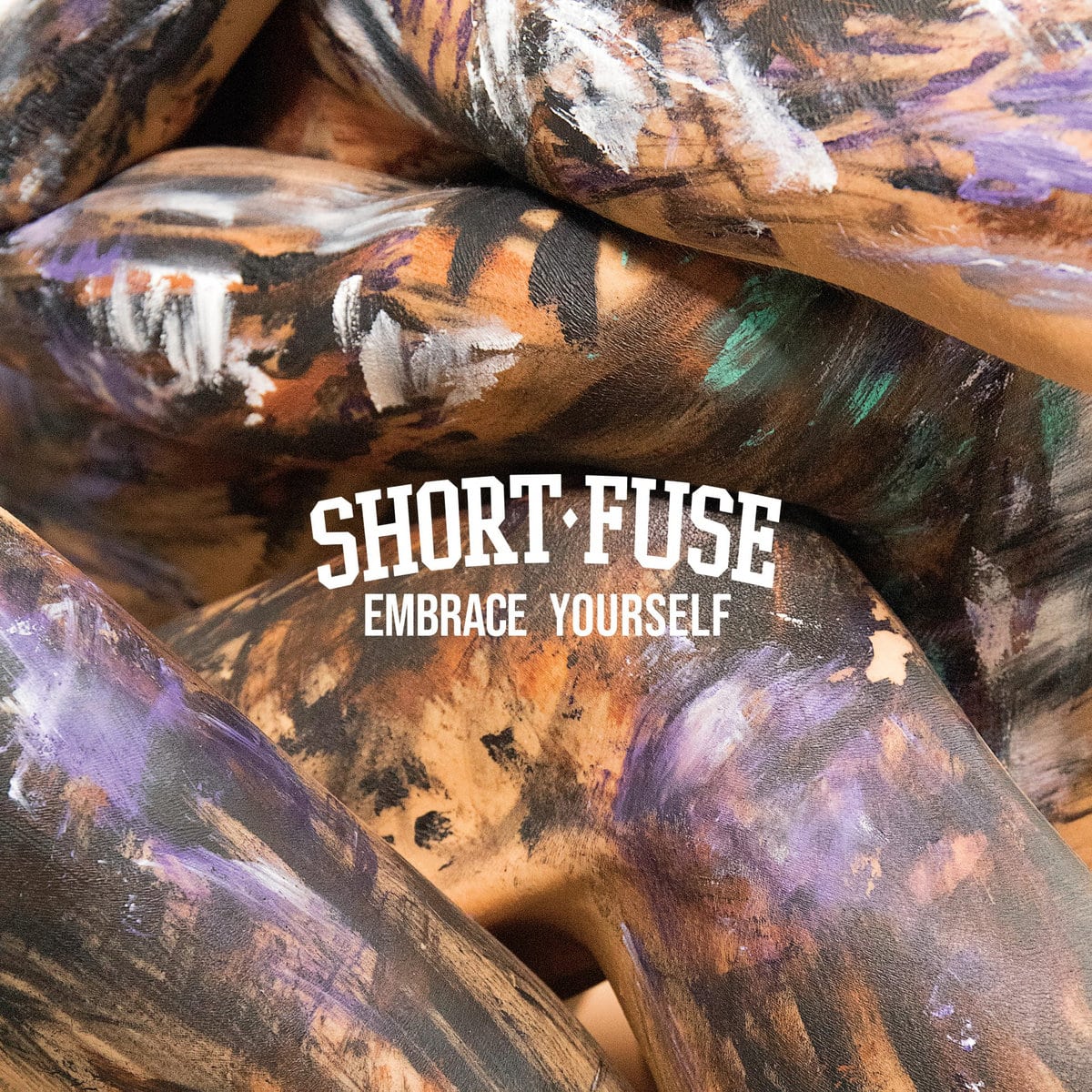
Bodies, canvases, gestures: the incessant cadence of need dictates the tempo. Movements reaffirm doubts and the need for confrontation, so that change can be generated, once again.
The artwork of Embrace Yourself deals with the strenuous resistance of fragility, facing the fear of being afraid. Different colors paint different moods, different feelings, emotions. The bodies are struggling to reach each other, while on the back cover they look distant, willing to touch, to embrace themselves, as if the process were reversed, as if the story told by the bodies started from the end.
The picture used for the artwork, just like the seven songs on the album, aims to represent equality and diversity. Althought it may sounds silly or trivial, we’d like to remind ourselves, as a community, that we’re all the same precisely because we’re different. At first glance we don’t know if the bodies painted in the artwork are female or male, and we also don’t recognize which body parts are depicted. The models involved in the making of the artwork are both non-binary precisely for this reason. So the picture looks elusive, ungraspable apparently.
We have been inspireds by body art, abstract paintings and performance art in the process of making the artwork. We aim to make an artwork that is both aesthically powerful and not self-explanatory, in order to stimulate people’s curiosity. I’ve always loved those records that don’t show immediately what kind of stuff you’re going to listen to. I’m a record nerd and moslty a digging addicted, and I’ve always been fascinated by those artworks that don’t fit strictly within the genre stereotypes. If you remove Short Fuse logo and the album title from the artwork, I think that it could match with any kind of music: it could be jazz, ambient, techno, indie pop, hardcore. Or at least I really hope so ahaha
The models have been painted by Valerio Miraglia aka Issachar while the shot has been taken by Silvio Giammarco.
English / short version:
More colors united by a hug, different colors united to represent equality than diversity. The two models on the cover are two non-binary people but we decided with the two guys who made the cover not to show the details of the body, the uninterpretable sexuality of the people involved precisely so as not to relegate the gesture of the embrace to a hetero thing (?). The different colors on the bodies also represent the different souls of the record, the different moods

